Is now the time to rebrand? Sure looks that way if you judge by some of the big names taking the plunge (see below: from Burger King to Rolls Royce). And the reasons are fairly obvious. The upheaval in worldwide daily life due to the pandemic has wrought changes in individual and corporate buying patterns, needs, expenses, and supply sources at a level none of us have experienced before. Consumers shaken by economic and personal chaos in the past year will, we assume, have a pent-up demand for new products and new approaches when making purchasing decisions in the post-pandemic world. Perfect time for a rebrand, right?
Well, maybe. In the midst of turmoil, some consumers may be looking for stability and toward trusted brands that provide familiarity and dependability. A rebrand that goes too far may alienate a customer base looking for comfort and security in the familiar. Of course, this is the essential dilemma any time a rebrand is considered: how much change is too much?
We know rebranding is expensive and time-consuming. Often, the impetus to rebrand grows out of a need to make logos, brandmarks and overall marketing more “agile” and consistent across platforms — to develop a mark that displays well on screens large and small, as well as in print. Perhaps a time of historic change like now would be a good time to evaluate the pros and cons of changing up your look. (Fast Company has good advice on how to think about whether the time is right for you.)
Of course, rebranding includes MANY areas of marketing – signage, web design, social media, printwear, and on and on –but it’s true that folks look first and foremost at a logo redesign. So it’s always interesting to see how the big players are changing up their logos during this time. Below are some new looks from today’s digital marketplace (old on left, new on right):
PEUGEOT
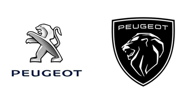 Peugeot is seeking to bridge the divide between past and present on the eve of their big push toward manufacturing electric cars. Their latest rebrand draws on a previous lion logo – ensuring familiarity for a brand that has been around for 210 years!
BURGER KING
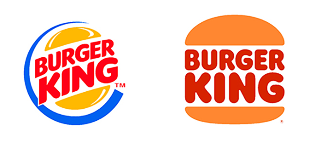 For the first time in more than 20 years, Burger King announced a brand-new logo, along with new packaging, uniforms, and signage. Described as “confident, simple, and fun,” the comprehensive overhaul again tries to benefit from both the familiarity of past logo designs and new simplified, digital-friendly changes.
GENERAL MOTORS
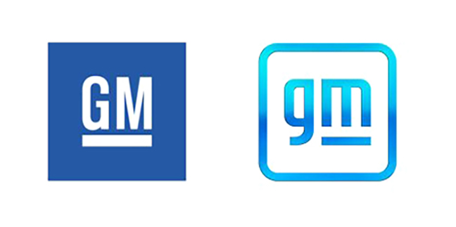 Another car manufacturer seeking to highlight its commitment to electric vehicles with a new brand is GM. Some critics think this rebrand is less than successful, but others give GM points for the “hidden” design element of an electric plug in the new shape of the lowercase “m” in the logo.
KIA
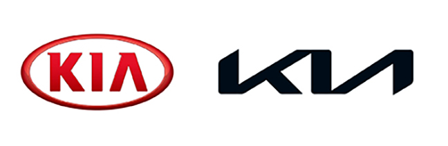 In a huge unveiling celebration in South Korea, Kia celebrated its best retail sales year ever in 2020—with a new logo for 2021. Kia also switched up for a new global tagline: “Movement that inspires.”
PFIZER
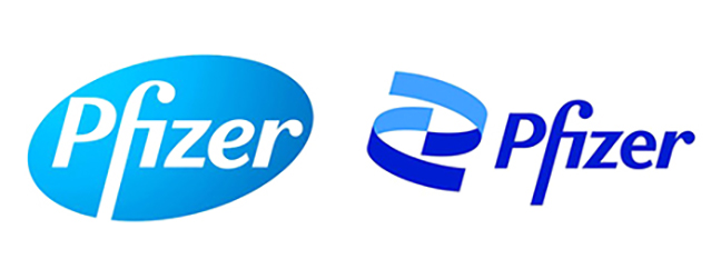 Fresh from developing one of the COVID-19 vaccines with BioNTech, Pfizer sought to rebrand with an emphasis on their switch from “commerce to science.” This is their most significant brand refresh in about 70 years. Did you recognize the DNA double-helix shape in the new brand?
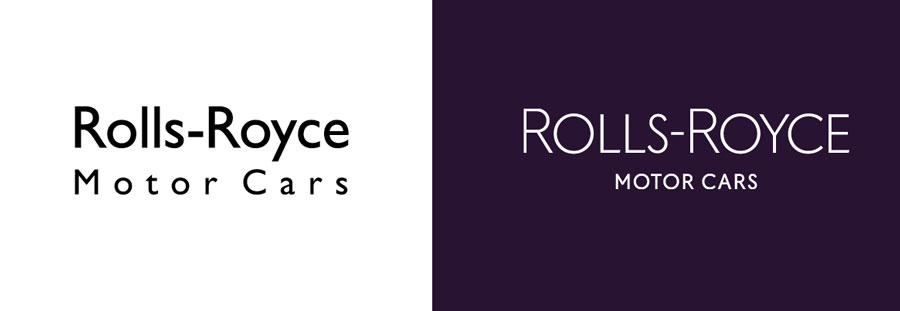
ROLLS ROYCE
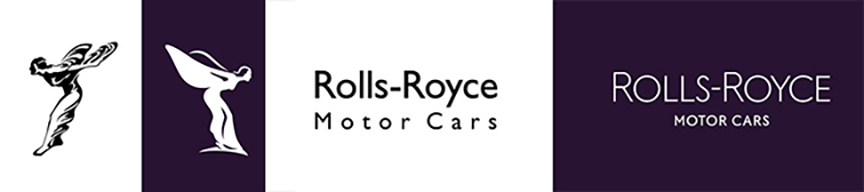 Rolls Royce premiered a new identity in a rebrand that seeks to move forward with digital-friendly marketing which remains true to the core identity of a luxury brand. They updated their typography and streamlined the iconic hood ornament design into the logo.
BUT CAN REBRANDING BACKFIRE?
Yes, it is a risk. When and how to rebrand — or not — is a tough call, with a lot at stake. Too much change at the wrong time can be disastrous. A slight modification may miss the mark. For example, in 2009, Tropicana removed the iconic Florida orange from their packaging for a more modern design… then reverted back after sales dropped by 20% in just one month!
Even if you decide a rebrand is not in your compnay’s best interest, the process of reaching that decision can be a great way to take stock of your image and your marketing needs. That clarity can go a long way in setting your marketing on the right track for what we hope will be post-pandemic prosperity.
Call us at 828.684.4512 for any marketing needs. As a printer, we understand communication, design, and teamwork. Your printer should be able to provide you with the latest information, inspiration, technical advice, and innovative ideas for communicating your message through print, design and typography, signage, apparel, variable data printing and direct mail, integrated marketing and environmentally responsible printing. If they can’t, you have the wrong printer! The best advice, always, is to ASK YOUR PRINTER!
ImageSmith is now partnered with Extreme Awards & Engraving – our in-house partner providing custom engraved trophies and awards for employee recognition programs, sporting events, and promotional needs. With our new sister company, we will be sharing space, resources and expertise in a collaboration designed to further provide you with one place to meet all of your marketing needs… Under One Roof! Visit them online at www.extremeae.com or call direct at 828.684.4538.
ImageSmith is a full-service print and marketing provider located in Arden, North Carolina. Contact us at ImageSmith for quotes on all your print and marketing projects, and more useful tips on how to create custom, effective, high impact marketing solutions.

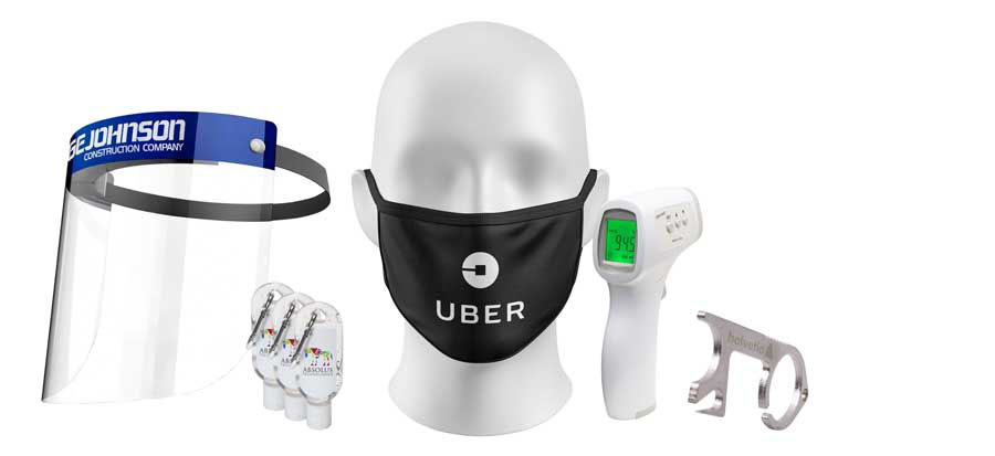 Pandemic Promos
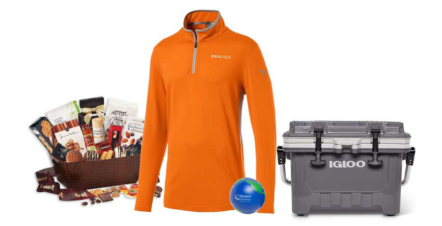 Staying Home
 Staying Healthy
 Promo Pampering
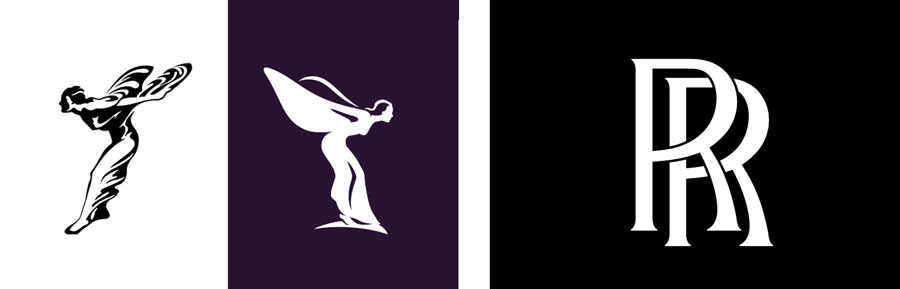
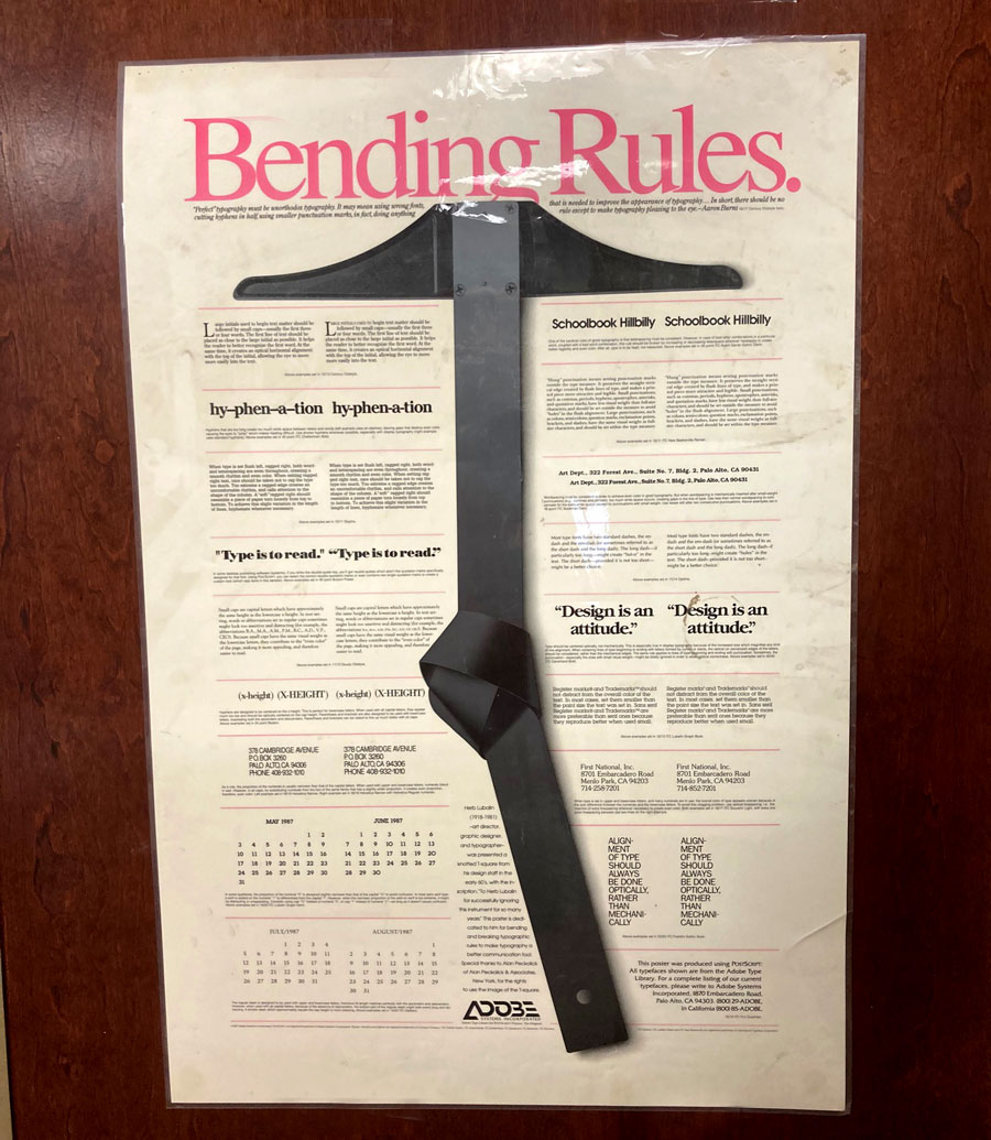
 Seeing something enlarged to a great size can reveal unseen tiny flaws – think of that bad selfie in harsh lighting. But by the same token, greatly reducing an image can create it’s own problems with recognition and readability. That’s where
 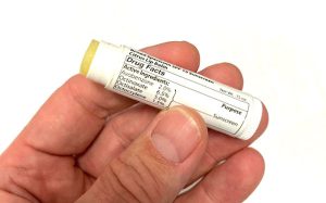 Great typography is a pleasure to read. But the requirements for that readability change with a font’s size. Today the need for easy-to-read small or “micro” type sizes is increasing in both print and digital applications. Why now more than before? E-books, smart watches, phones, and other devices with small screens require fonts with quick readability at a small size and resolution. On the print side, prescription bottles with dosage directions, food packaging with nutritional info, and almost all product packaging that includes ingredients or warnings need a readable font at small point sizes to clearly impart information.
 In general, most fonts were designed for the average reading environment – as in comfortably reading a book or newspaper – in the 8 point to 14 point range, and for a viewer with 20/20 vision. Being
 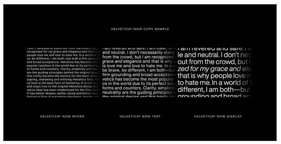 One great example is
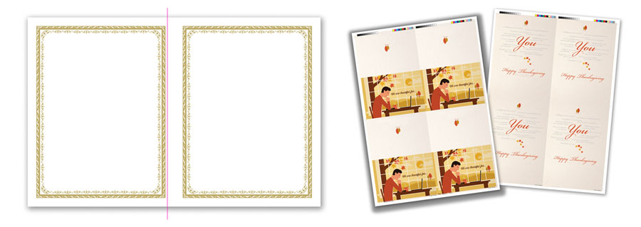
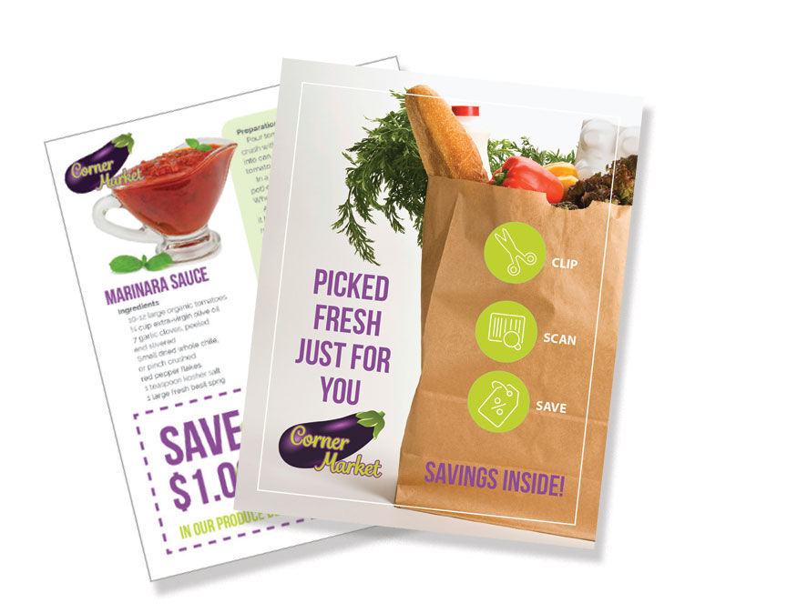
 Planning a strategy to your market outreach, rather than just looking from event to event, is a game-changer for small and medium sized businesses. Just as a restaurant might develop different menus for lunch, dinner, take-out, or catering, you can create a series of flyers that
  The flyer does not have to just be a boring sheet of paper. Consider
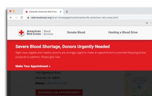 BE GENEROUS – donate to

 when you order promotional products, you receive a price per piece far lower than the usual retail cost. Some items are very inexpensive, and others more high end. Test the waters with a low cost item, or reward valuable customers with a keepsake item for the holidays… all branded with your logo, contact information and message. When the product is something that will be used in public – such as an umbrella, sports equipment or
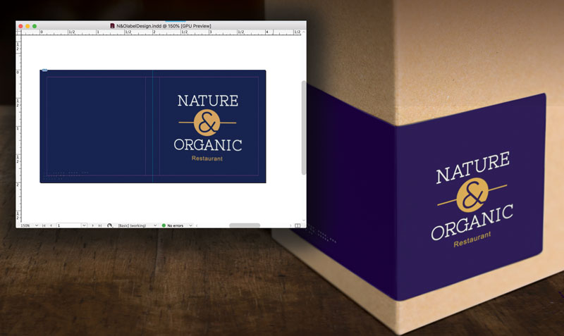
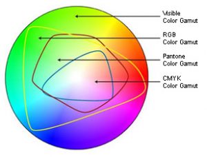
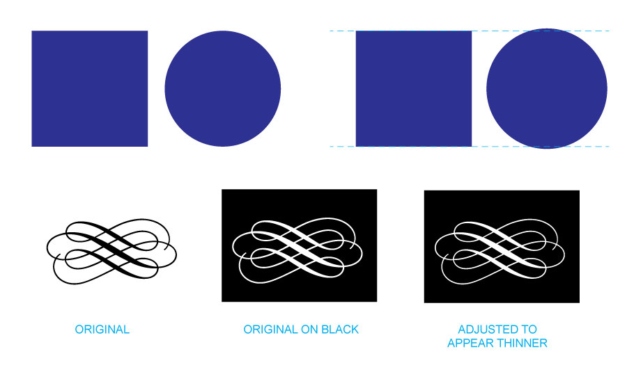
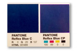 Defining a “spot blue” in your work does not mean you must always print offset, using the spot ink. Still, it gives your printer a marker of what you intend that blue to be at output. Now here comes the next hurdle – you will need to take into account the color shift that will happen when printing a PMS-defined color in CMYK. Again, we can thank the differences in color gamuts for that. For many colors, the shift is slight – for others it can be significant. Designers and printers should be able to show you both color swatches of the PMS color you chose, and of any color shift that will occur from switching to the CMYK equivalent of that color.